Opening Financial data for good
Client: Smart Data Foundry
Role: Brand, Art Direction, UX, UI
Work completed while at tda!
Illustrations commissioned from Josh Warren
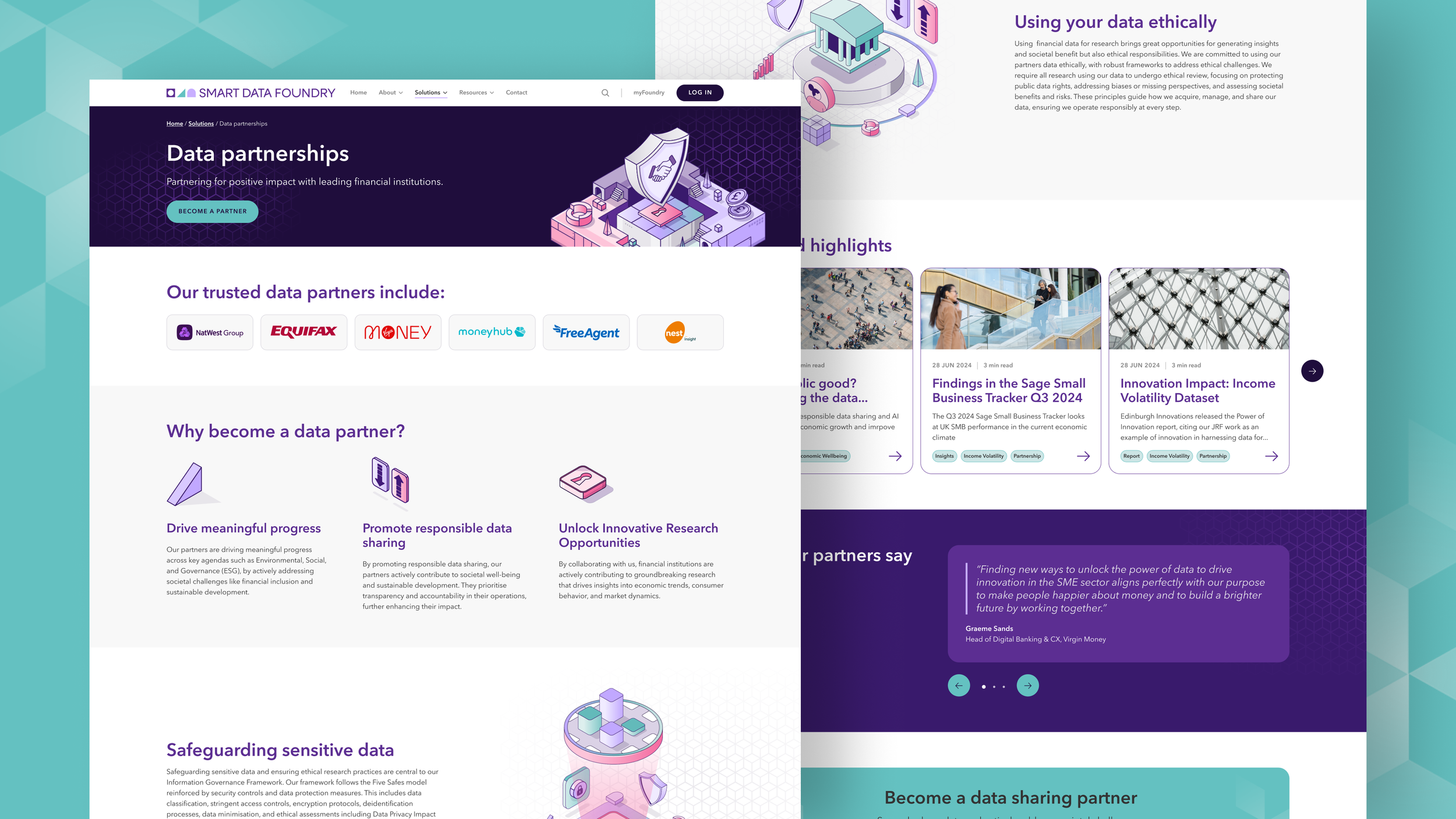
Smart Data Foundry (SDF) is an organisation which specialises in the innovative analysis of private-sector financial data. Their mission is to improve people’s lives, businesses and communities by using their findings to tackle the biggest societal, economical and environmental issues across the UK.
Until now, financial data has mostly been kept private and used mainly for profit or product development. Barriers such as privacy concerns and regulations have made it hard for it to be used more broadly for research or to help society. SDF works with leading financial institutions to make data available to everyone, by securely and responsibly sharing real-time data with partners who want to make a positive impact, and helping build a stronger economy and fairer society.
The brief
SDF had an ambitious vision and a growing suite of data products, but their website no longer reflected who they were or what they offered. The members’ portal was also in its infancy, with manual onboarding and limited functionality. Our goals were to:
Create a clear digital ‘shop front’ that communicates SDF’s value and drives enquiries.
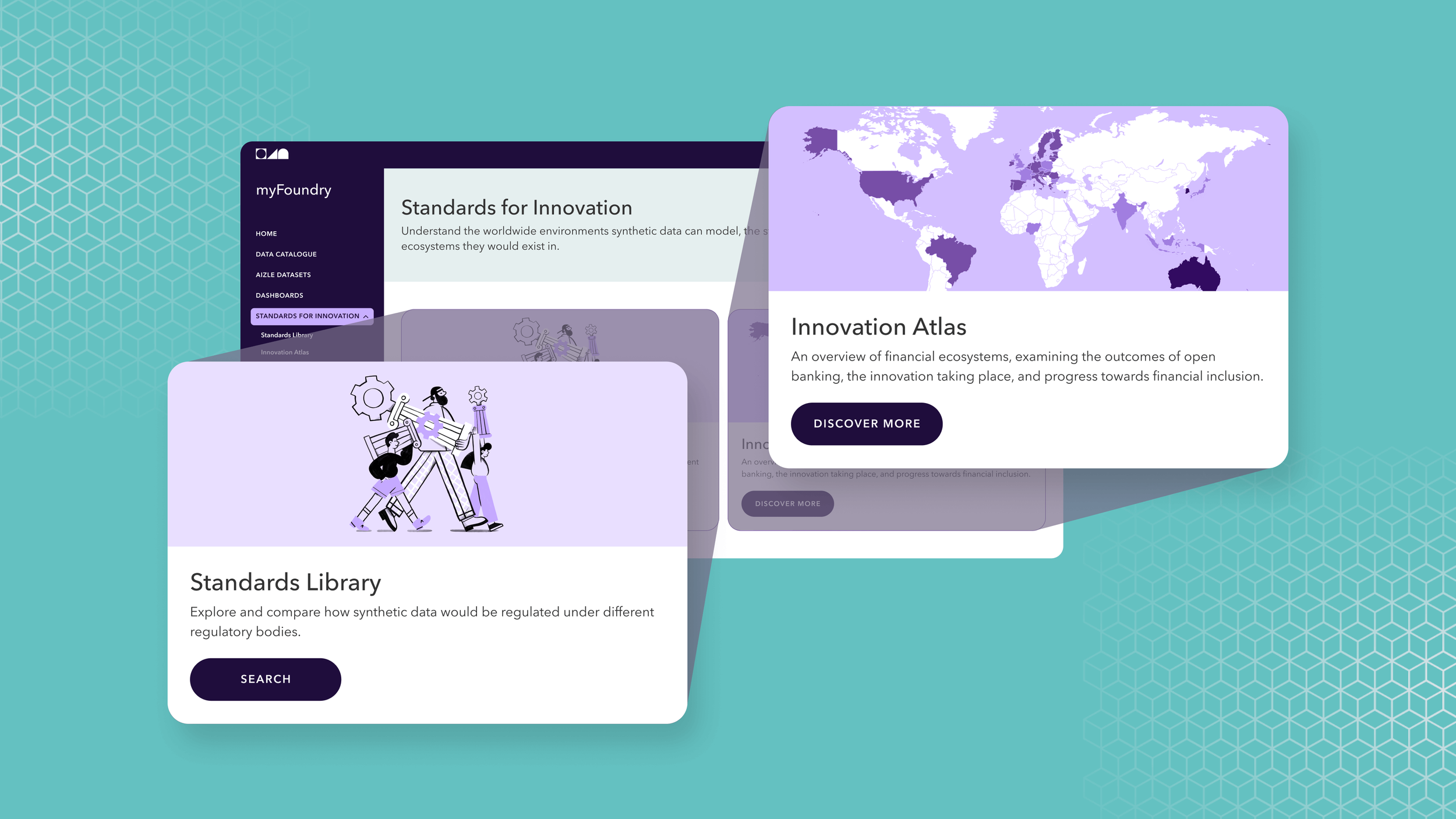
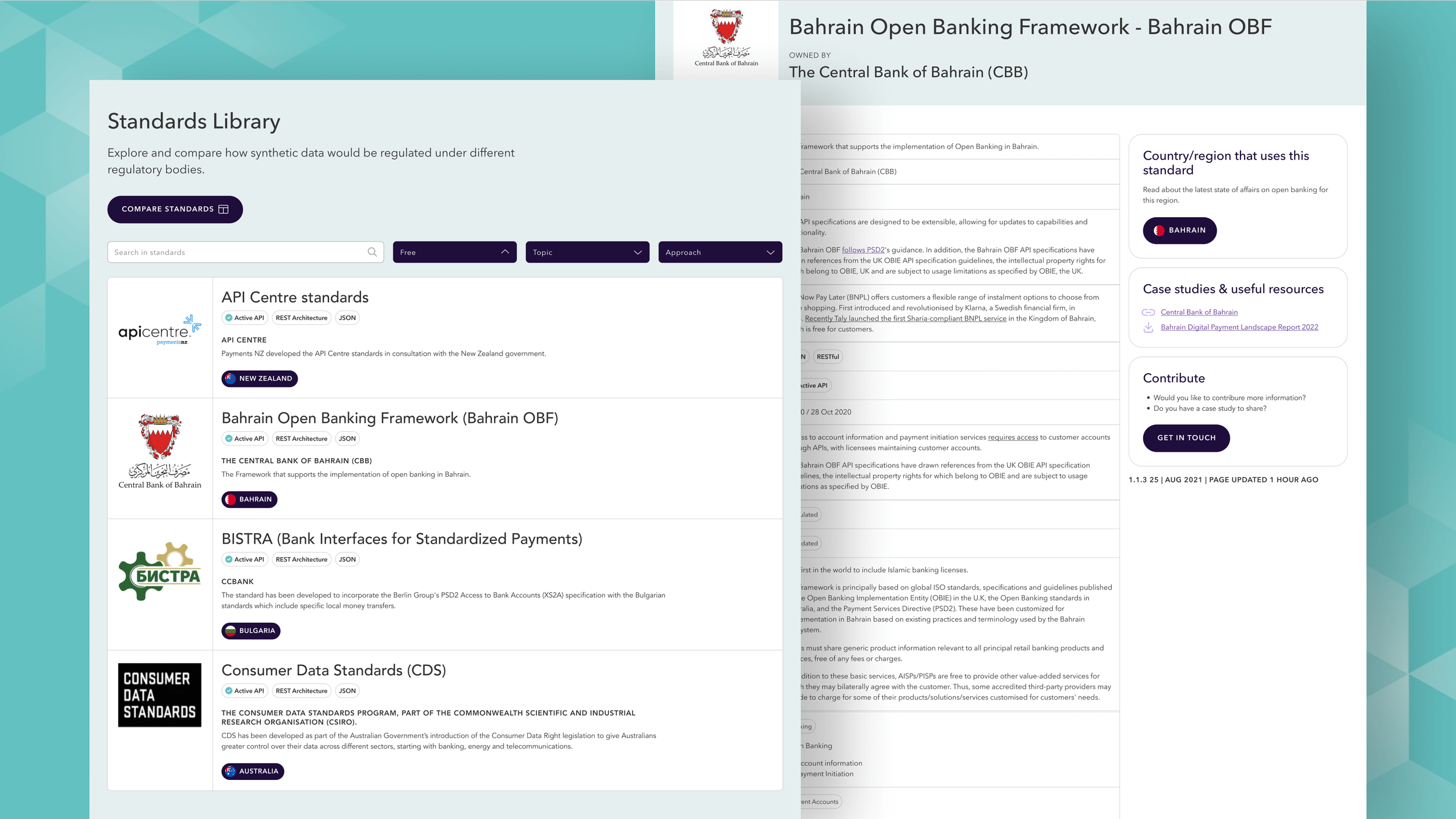
Design a personalised members’ portal for seamless onboarding, account management, and data access.
Refresh and extend the brand identity for digital use.
Build a scalable design system to unify the website, portal, and data visualisations.
Deliver a user-centred experience that makes content and actions intuitive and engaging.

A strategic approach
We started off clarifying website goals and objectives, and conducted an audit of their current sites. Together we refined their target users and personas, scoped out a new information architecture, and identified key features and functionalities. It was important to create a seamless experience between the main site and the portal all whilst creating a cohesive brand experience.

Illustration & animation
A bespoke set of isometric brand illustrations and a new house style helped convey complex ideas in a clear and engaging way across the website and all marketing channels. The modular isometric approach allowed individual elements to combine into larger, immersive scenes, while a supporting icon set was created for use across digital, print, and video materials.
The hero image visualises SDF’s Data for Good story: private sector financial data flows into SDF, is transformed into insights, and flows back out through academia and the public sector to create positive societal impact.
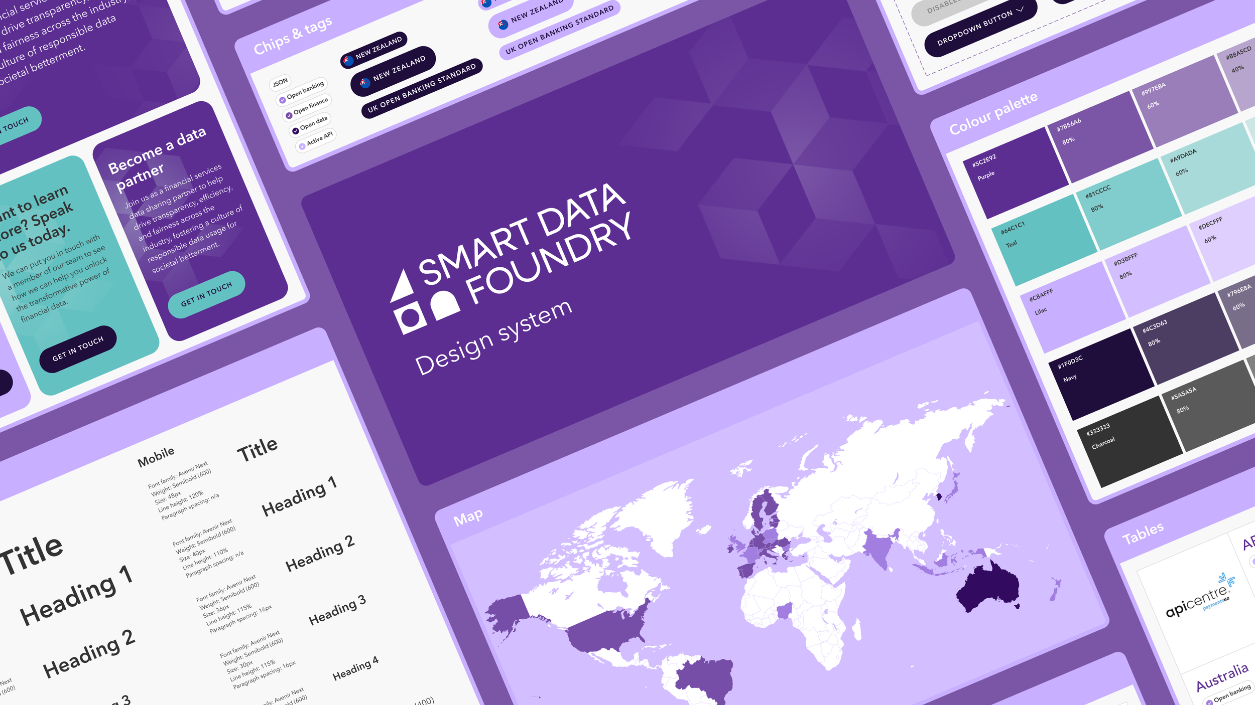
The Design Playbook
Once the master logo and colour palette were refined, a master design library was created which contained key elements such as reusable components, styles, and assets. Core components such as buttons, forms, and navigation menus were organised into categories, with responsive design principles applied to ensure adaptability across devices. A 'playbook' of guidelines was also published to help act as a comprehensive resource for designers, developers and data scientists (who were building data visualisations).

A unified and user friendly site
The design system successfully unified a two separate sites by providing a comprehensive framework of reusable components, consistent styles, and clear guidelines. By standardising elements like typography, color palettes, spacing, and interactive components, the design system ensures a cohesive look and feel across all pages and features. Its modular structure now enables better efficiency by streamlining collaboration between designers and developers and speeding up updates.