Charity Zone
Client: Kinder
Role: UX, UI
Kinder is a tech-for-good start-up whose mission is to empower people to do good, better. Through research, data, and storytelling they give people confidence in contributing to effective charities – and give those charities themselves, the tools to elevate their mission.
They understand not all charities have the resources to afford external research and get advice on how to improve. So they committed to providing the results of their research to Charities they’ve vetted - for free - through the Kinder Charity Zone. The end goal is to solve world problems faster, so Kinder believes in sharing the results of their research to those charities to help them become as effective as much as possible.
The brief
The wealth of data and insights the research team had collected wasn’t being displayed on the platform in a useful way. The research team were keen a charity could view how they scored in each area, access customised advice, and show how they performed compared to their peers as they believed this would encourage them to improve, especially if they placed on the lower end of the scale.
The team also didn’t have much in the way of an onboarding strategy. In order for Charities to see their full results, they needed to sign up for an account and they were dealing with the fact that most of the charities they were vetting hadn’t heard of Kinder before.
Approach
Based on the business goals and perceived user needs we formulated a set of user stories that informed the next design iteration:
Users want to know who Kinder is and what they’re offering them
Users want to see their results of how they performed against Kinder’s vetting framework
Users want information on how they can improve in areas they scored low in
Users want to request re-vets if they have made improvements or disagree with their results
Once we agreed on the content and structure I created a prototype (Using Sketch and Invision) to run user testing sessions with a group of our target users - key decision makers within charitable organisations. The aim was not only to validate the redesign but the content as well. We tested the user journey starting from the initial invite email through to registration and viewing their results.


The finished result
We reduced the number of ‘click’s users had to make before viewing their results
Included testimonials relevant to their industry and location helps, as well as more personalisation.
Explicitly explain what the costs or ‘catches’ are and not hide in small print.
Reframe the perspective from talking about Kinder’s services to highlighting the benefits for them.
Simplified and cut down copy as the audience is time poor.
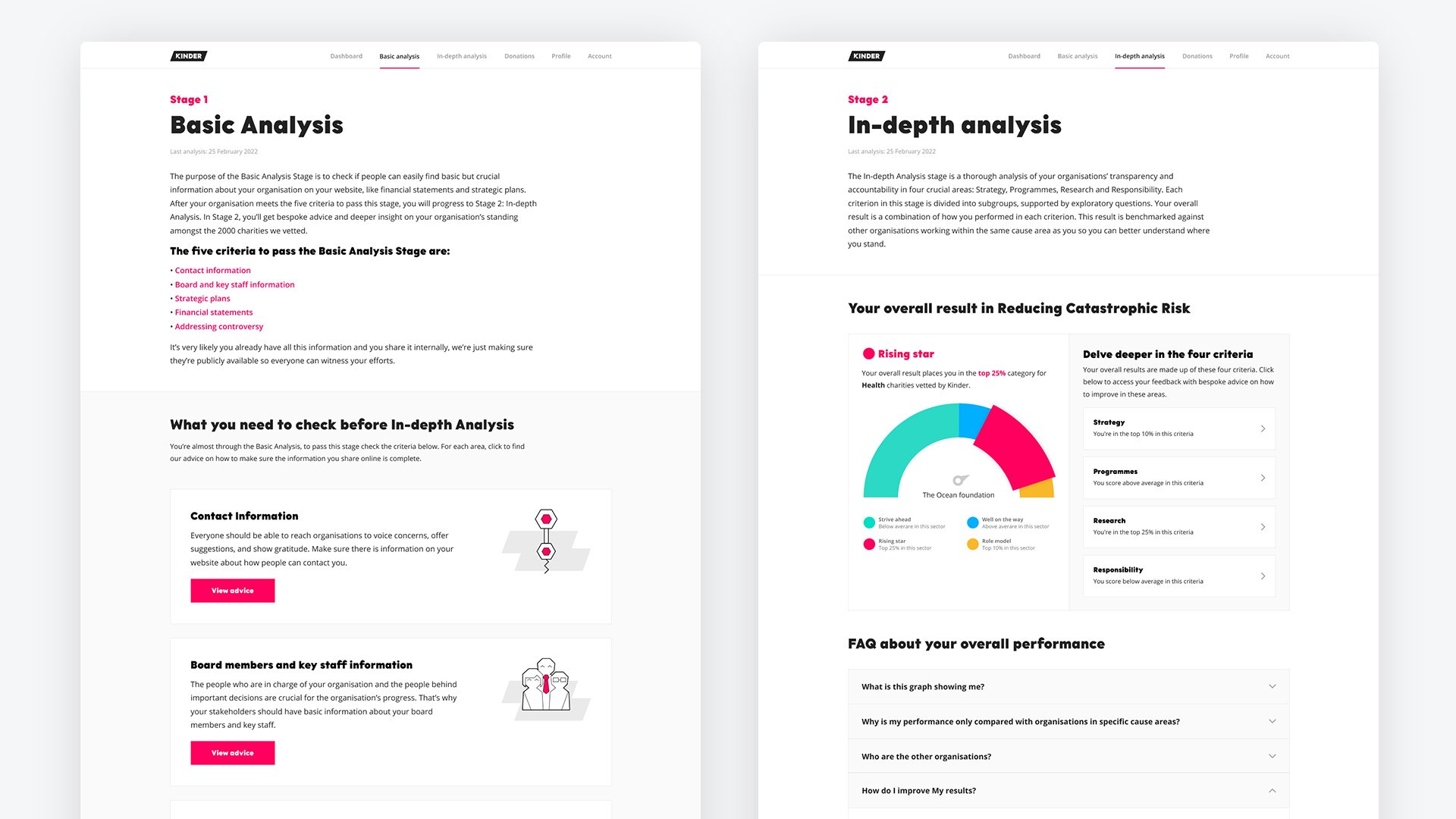
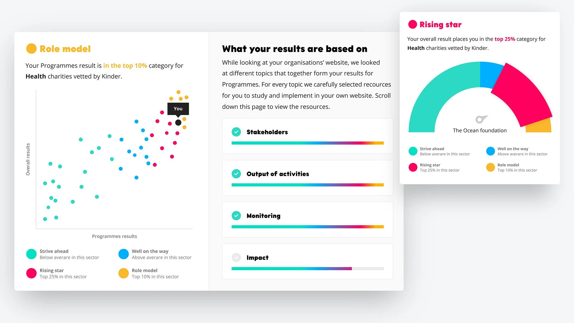
Give a brief explanation of how we arrived at their score and include FAQs.
Removed mentions of ‘payment detail’s too early in the user flow.
Added more copy to explain improving their scores will lead to more donations.
Dashboard cards changed dynamically according to priority and what stage they were at.
Made visual amends and added more personalisation to graphs so users didn’t think it was generic.


