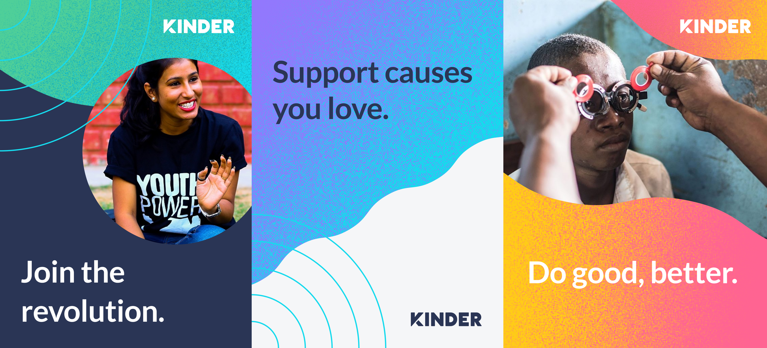
Brand and UI refresh
Client: Kinder
Role: Brand identity, UI
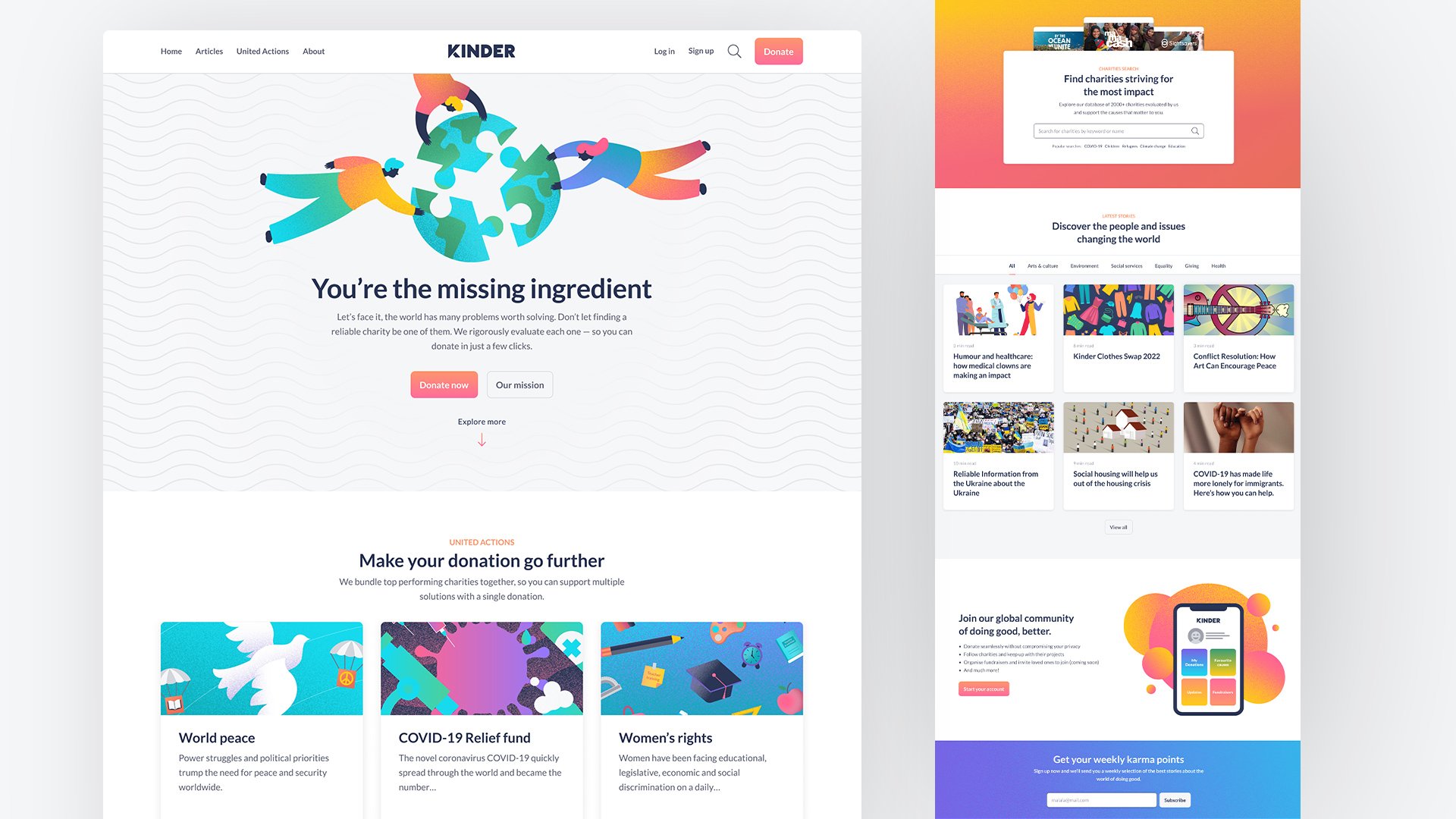
Kinder are passionate about empowering global citizens to do good, better. They know that trust in the charitable giving sector is at an all time low – and that as individual people, we can struggle to feel like we can make a real difference when it comes to global issues. Kinder fight these obstacles with solutions that help both the charitable giving sector and individuals become more impact-driven and informed. The result is a team of global organisations and citizens who are able to make a real, meaningful difference to the causes they care about.
Summed up, their three main areas of focus are:
Enabling seamless and effective donations through tech-for-good tools.
Steering organisations towards becoming more transparent and accountable.
Informing individuals about organisations that will use their donations and engagement the most effectively.

The challenge
When I joined Kinder it definitely felt time for a much needed re-brand. As with many start-ups, they pivot and change which meant the brand identity they had became unfit for purpose. The original identity was heavily influenced by brands like Vice which is quite edgy and aimed at a GenZ audience (it was designed by students). As Kinder grew they wanted to appeal not only to charities but also a wider audience. It was generally felt that the edginess and aggressive look and feel alienated parts of their target audience.
They needed cohesive brand story. Every time they attempted to talk about themselves and from person to person, they said something different. Kinder was trying to build an ecosystem but was getting lost in amongst all the different things that they did.

The solution
We worked with brand copywriters and ran workshops to help define Kinder’s brand story and get to the essence of who they were and their vision. And for the first time they were able to clearly articulate to their audience (and themselves) what they did.